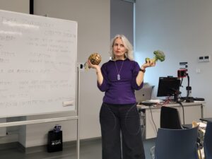
Julie Brunet is an independent information and data designer known as Datacitron and a two-time lecturer for the MediaNumeric programme. During the winter school in Paris, and more recently, the summer school in The Hague in June 2022 Julie gave her hands-on lectures on the panorama of multimedia storytelling & the contributions of data and the techniques & tools adapted to multimedia storytelling. Julie believes in the accessibility of information through design and storytelling, as well as the virtuous role data designers can play in a society shaped by the ever-increasing amount and complexity of data.
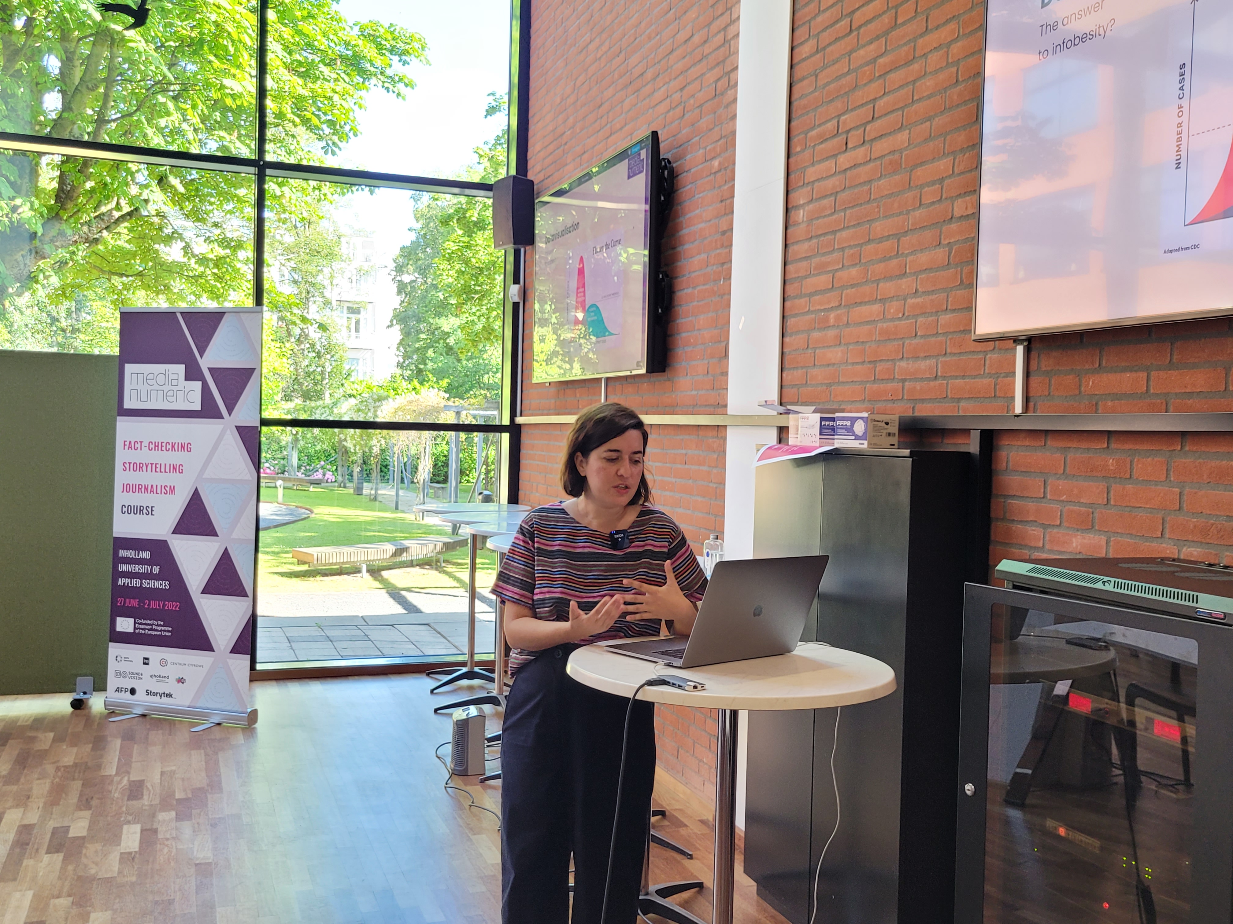
Data literacy as part of public education
Julie is an advocate for educating younger generations on data literacy with programmes such as MediaNumeric, but also even in high school and middle school: “Data are all around us. That’s always been the case. But now with big data being collected everywhere and at all times, it’s become so important to educate people on data literacy. The most natural thing to do would be to include it in university curricula, but even better would be if we could address the topic at a much earlier stage in public education. That would be amazing” says Julie.
Components of a data story
Julie uses her expertise as an information and data designer to visually translate data into a story in order to make them more appealing, but even more importantly, more accessible to a broader audience. “All data tell a story. But the story often doesn’t speak to a broader audience because the data is so heavily focused on the statistical and mathematical aspects. And that’s where data designers come in” explains Julie.
So what are the different components that make up a story told with data? Julie defines three main roles, all with their own set of skills and expertise; the writer, the visualiser and the coder. “You have the title and the caption, the image, the illustration or animation, the sounds, the timing of the story, the perspective, the metaphor, and just so many other components. All these things by themselves don’t really convey a message, but when they are combined they tell a story”.
Playing on emotion
“The problem with data is that our brains aren’t really wired to comprehend them” finds Julie. Therefore, data designers and storytellers try to engage the public on a more emotional level. “Even though we are rational beings, our minds react mostly to emotion. There’s also just so much going on in the world that we experience a kind of information overload” explains Julie. A great example of a story told with data that plays on our emotions is that of the New York Times on climate change: How Much Hotter Is Your Hometown Than When You Were Born?. You enter your hometown and birth year into the interactive tool and it shows you just how much the climate has changed so far and how much hotter it may get. “The tool takes something so broad and makes it really personal. You really connect with the data and the situation. I think it’s a truly brilliant example of storytelling with data” says Julie.
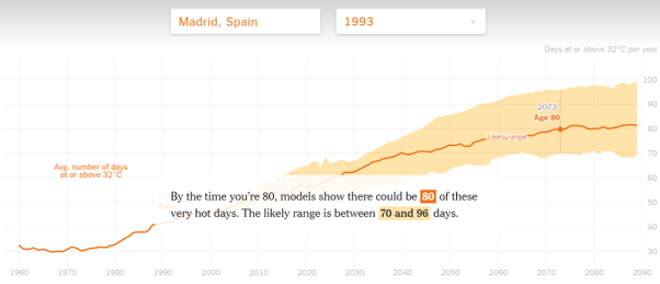
change for a person born in Madrid, Spain in 1993.
Igniting a fire?
Julie’s lectures during the MediaNumeric courses are very practical. The students actually get to work on visualising data themselves with tools such as Flourish, a free, user-friendly yet powerful tool for telling stories with data. The most important when selecting a tool for data visualisation is its transparency: “You have to be transparent in your storytelling. People don’t just play on emotion for good, they can do so for bad as well” warns Julie.
“Data design and visualisation are like fire. You can warm someone up or you can burn a city down.“
– Julie Brunet
In October 2019 Lara Trump, the then president Donald Trump’s daughter-in-law, presented a county-by-county results map of the 2016 election. The map was a sea of red supposedly visualising the counties Trump had won. The words ‘Try to impeach this’ were stamped across the middle of the map. “Luckily, the tool [DataViz] used to create this map was very transparent,” explains Julie “so another data designer came in and took the same data and created an entirely different visualisation which was much more accurate to the situation.
Challenge accepted! Here is a transition between surface area of US counties and their associated population. This arguably provides a much more accurate reading of the situation. @observablehq notebook: https://t.co/wdfMeV5hO4 #HowChartsLie #DataViz #d3js https://t.co/lStHeeuMUw pic.twitter.com/MpYiXtsHmu
— Karim Douïeb (@karim_douieb) October 8, 2019
Warsaw 2023
After having taught at two of the MediaNumeric courses already, Julie will also be joining us in Warsaw in February 2023 for the third and final iteration of the programme. “What really made me want to be a part of MediaNumeric is that the course is accessible and inclusive. I also think it’s amazing that the programme is so extensive. There are so many different speakers here from different fields and from all over Europe. I love seeing countries in the European Union working together” concludes Julie.
Do you want to take part in MediaNumeric’s winter school in Warsaw this February? Sign up for the free Erasmus course on data-driven journalism, creative storytelling and fact-checking by 2 January 2023!


